Why LinkedIn content marketing builds more trust and credibility | and how you can take advantage of it in 3 steps
Imagine waking up to an inbox flooded with emails and yours is the one that stands out, compels action, and actually drives sales. For ecommerce owners, business leaders, and email marketers, discovering how to design emails that consistently generate high click through rates (CTR) is a game changer. After thousands of tests and iterations, we cracked the code "the secret sauce" which is treat every email like a mini landing page.
Imagine waking up to an inbox flooded with emails and yours is the one that stands out, compels action, and actually drives sales. For ecommerce owners, business leaders, and email marketers, discovering how to design emails that consistently generate high click through rates (CTR) is a game changer. After thousands of tests and iterations, we cracked the code "the secret sauce" which is treat every email like a mini landing page.
Why Designing Emails Like Mini Landing Pages Works
Most emails are quickly scanned, ignored, or deleted because they feel cluttered, overwhelming, or confusing. But when you shift your mindset to treating your email as a focused, conversion optimized landing page, everything changes.
This approach ensures:
A clear path for your reader from open to click
Engaging, concise content that respects time and attention
Visual hierarchy that naturally guides eyes toward your CTA
Seamless experience on mobile and desktop
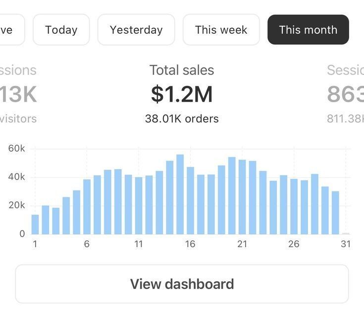
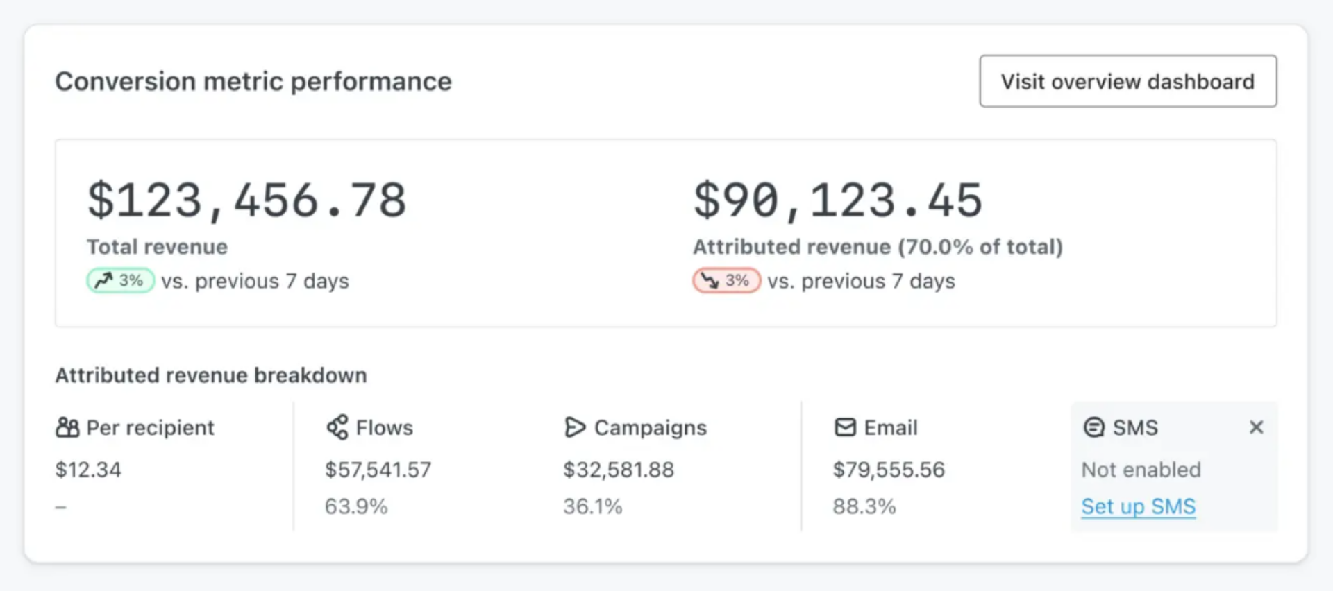
Klaviyo Performance Screenshot
What Makes High Coverting Emails?
Compelling, Clear CTAs: The cornerstone of conversion. Button style CTAs in contrasting colors with action-driven text like “Shop Now” or “Claim Your Offer” grab attention immediately. Place them “above the fold” and repeat strategically.
Bite-Sized, Benefit-Focused Copy: Lengthy paragraphs kill engagement. Use short sentences, bullet points, and highlight benefits rather than product features.
Visual Storytelling: Beautiful images or GIFs that showcase your product or brand create emotional connection and trust.
Mobile-First UX: Since more than half of emails open on mobile, responsive design is non-negotiable. Large fonts, tappable buttons, and vertical layouts are essential.
Personalization: Using names, behavior triggers, or customized offers makes your audience feel seen and increases clicks.
Social Proof & Urgency: Reviews, testimonials, limited time offers, or countdown timers build credibility and push for action.
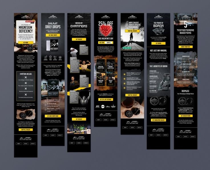
Figma Email Designs
How Sarah Doubled Her CTR
Sarah, owner of a sustainable fashion ecommerce store, was frustrated by low engagement despite great product offerings. After redesigning her emails as mini landing pages with bold CTAs, personalized greetings, and concise messaging, her CTR doubled within one campaign. It wasn’t luck it was design grounded in tested principles.
The journey to perfect email design never stops. Every audience reacts differently. Use A/B tests to experiment with:
Different CTA colors and text
Varied subject line styles
Message lengths and formats
Analyze results and refine your template continuously to keep maximizing CTR.
Treat your emails like mini landing pages with clear, engaging, action focused digital experiences and you’ll unlock consistently high click through rates that drive business growth.
.png)